I must really be #4Life if I’m ready to suggest a new Daily Create.
 CALVINBALL! Mashup the pieces of at least 2 unrelated games into a new game. Take a picture.
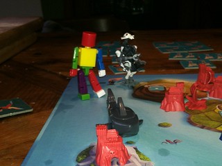
This picture actually comes courtesy of my son, who is seven. At that age, if Settlers of Catan Junior takes place on islands, then of course we should get the shark from Get Bit! And if the game is good with a little plastic figure of a Ghost Pirate, of course it would be better with a LEGO General Grievous. The robot from Get Bit! is my addition; the rainbow coloring was his.
He once called this ability “connectionation” – which is, of course, the imagination which sees new connections. I vaguely recall it being his kindergarten teacher’s word. It puts me in mind of the Stephen Johnson video about the birthing of good ideas, from week 1 of the Open DS106 syllabus. Admittedly, his mind doesn’t do anything slowly as Johnson describes, but it’s fascinating to watch the way his mind lets different ideas bump into each other and riff freely against each other.
It’s inspiring… and occasionally infuriating. The true story of that photo is that I missed the chance to get it some months ago. So this time, instead of explaining why there can only be one thief on the board, when he introduced General Grievous as the second Ghost Pirate, I got up and got the Get Bit set. Immediately, I was having a better time imagining new play than being the rules lawyer, and he pretty quickly estimated that we’d have a board full of Ghost Pirates if we didn’t pull back inside the magic circle just a bit.
Should this be accepted as a Daily Create, I’ll leave my first attempt at this shot here:

I don’t like the lighting on this shot, but it does capture some of the feel for the game. Compare and contrast with a better lit and composed overhead, which unfortunately loses all the detail of the toys:


 So the idea was fresh in my mind, when it happened that I walked past a Hot Topic, with a Game of Thrones display in the window. Now the truth is I’m not a GoT fan – haven’t read the books, don’t have HBO, just haven’t gotten into it. But something about the bird and the swords and the Season 4 slogan struck me.