I already drew a map which tells a story, so when TDC 1237 challenged us to make a map which explains nothing, it seemed like a fitting challenge. I was inspired by the map of “Super Bowl Wins By Country” on the TDC page, so here’s:
Change in MLB Batting Average by US State 2005-2014
(Edit: this used to be an interactive map. But Google killed the product. So here’s a screenshot.)
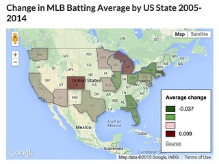
This map is made with Google Fusion Tables. The team batting average data comes from Baseball-Reference.com; the state shapes are a resource file within Fusion Tables. (This introduces the one unintentional inaccuracy in the map – I couldn’t quickly find a shape file including both U.S. states and Canadian provinces, so the Toronto Blue Jays are just left off the map.)
More importantly, its story is a mess. For starters, who would compare team batting average over 10 years? There are so many differences in lineups and managers (and probably even park effects) that it seems like a pointless comparison. (My baseball geek friends are welcomed to debate that point.)
“Batting average by state” is almost as meaningless as “Super Bowls by country” – maybe more so, because it suggests specificity. But if there’s a useful reason to compare the average batting average of the 5 teams in California with the 1 in Maryland, I’m at a loss to explain it. (And you can barely see the poor Nats in DC.)
The state statistics are actually an average of team batting averages in the state, but every team doesn’t have the same number of at bats, so that introduces a little inaccuracy. Not much, but it would show up out at the 4th digit.
And then there’s design. Google only labels the top and bottom of the legend, so we know the bounds, but not what the middle colors correspond to. I picked a green color for half the scale, on a map which is mostly green – very bad for readability, especially in the Satellite view. I also set green to correspond to the biggest declines, and red for the biggest increases, which I think is the opposite of American expectations.
But I did learn a little about Fusion Tables, and practiced normalizing data, so that was fun!
I am tempted to write a comment longer than this post to say how cool this is- from combining data and visuals, to prodding me to want to do learn to use fusion tables, but mostly, what a great idea to approach the challenge (which in hindsight is more a scope of a DS106 assignment than a Daily Create).
So why Colorado and Michigan so improved? The East Coast seems more solid over space and time?
And I know Arizona is a weird place, but it is my home (and hosts most of Spring Training), why are the Diamondbacks not represented?
So good, Joe, thanks.
Ugh. The answer is an error in the Google Sheets pivot table which underlies this data. (The Arizona row got interpreted as a column header, not data.) Trying to fix it now.
Found and fixed it. There is probably a simpler approach than “cut and paste data into Sheets, do calculations in separate worksheets, import particular worksheet into Fusion Tables, merge that Fusion Table with the shape file.” On the other hand, while it means there are more places to look for errors, it does preserve every step of the data crunching.