I’ve been amused by the #15secondshakespeare phenomenon, so I was pretty stoked when it showed up as a daily create. I actually thought I was going to do a different old standard… but then, in honor of making another trip around the sun, I picked this one. Honestly, I’m kind of hoping it’ll go viral. Surprise your friends with it.
The music is “Go From My Window“, a 16th century folk song as arranged by John Dowland and performed by Frank Hiemenz, under a CC-BY license. (It’s really quite pretty when I’m not over-acting over it.) I dumped it into GarageBand and recorded my voice in another track. Lining up my voice at the end of the first phrase was a pretty clear choice; I had to fade the guitar down (further than I thought I’d need to) and adjust the spoken volume up a bit.
I already drew a map which tells a story, so when TDC 1237 challenged us to make a map which explains nothing, it seemed like a fitting challenge. I was inspired by the map of “Super Bowl Wins By Country” on the TDC page, so here’s:
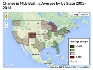
Change in MLB Batting Average by US State 2005-2014
(Edit: this used to be an interactive map. But Google killed the product. So here’s a screenshot.)
This map is made with Google Fusion Tables. The team batting average data comes from Baseball-Reference.com; the state shapes are a resource file within Fusion Tables. (This introduces the one unintentional inaccuracy in the map – I couldn’t quickly find a shape file including both U.S. states and Canadian provinces, so the Toronto Blue Jays are just left off the map.)
More importantly, its story is a mess. For starters, who would compare team batting average over 10 years? There are so many differences in lineups and managers (and probably even park effects) that it seems like a pointless comparison. (My baseball geek friends are welcomed to debate that point.)
“Batting average by state” is almost as meaningless as “Super Bowls by country” – maybe more so, because it suggests specificity. But if there’s a useful reason to compare the average batting average of the 5 teams in California with the 1 in Maryland, I’m at a loss to explain it. (And you can barely see the poor Nats in DC.)
The state statistics are actually an average of team batting averages in the state, but every team doesn’t have the same number of at bats, so that introduces a little inaccuracy. Not much, but it would show up out at the 4th digit.
And then there’s design. Google only labels the top and bottom of the legend, so we know the bounds, but not what the middle colors correspond to. I picked a green color for half the scale, on a map which is mostly green – very bad for readability, especially in the Satellite view. I also set green to correspond to the biggest declines, and red for the biggest increases, which I think is the opposite of American expectations.
But I did learn a little about Fusion Tables, and practiced normalizing data, so that was fun!
(Kids, ask your parents. Or possibly your grandparents.)
As you can tell from the watermark, I used WeVideo to make this. We’ll be using it next week at a workshop run by the Center for Digital Storytelling, and I’m the local tech support, so I thought I better try it out. It’s a web-based video editor, with a clean interface; I can see why it might work well as an intro tool for new video editors and in community outreach situations.
Also, it can import video from a USB webcam, which apparently iMovie can’t. This shot comes from my Logitech webcam, perched upside-down on top of my monitor. (That simultaneously solved the problem of how I can film my own hands, and how I could get the writing right-side-up.) My hands aren’t quite in frame enough at the end, but it got the concept.
The silence at the beginning is a little disorienting; if I were going to work more on it I’d try to capture the sound of pen on paper or maybe add a soundtrack. Let’s file that under “lessons learned”, and certainly not under “regrets!”
Daily Create 1180 asked us to create a soundmap of our town. Instead of following the prompt as written, I picked one moment in my day – walking home in the early afternoon from a Krudas Cubensi concert at Kenyon College.
It was early April – the trees were starting to bud, and you can hear a light spring breeze blowing through the microphone at places. The birds have returned, and you can hear them chattering at each other. But it’s too early for the hum of lawnmowers, not warm enough yet for the drone of air conditioners. Gambier is a rural town; I think in the 6 minute walk you’ll hear 3 cars go by.
You’ll also hear my feet. Boy, will you hear my feet. I really thought I was holding my iPhone high enough to not get so much of that noise, but apparently not. So, there’s an excuse to learn something new – I opened up the graphic equalizer in GarageBand, turned on the analyzer so I could see where the frequencies of my footfalls lay, and turned those ranges down. They’re still prominent – it is a walk, after all – but I don’t think they’re as dominant as they were in the original.
This is my walk to work. I’ve probably taken it more than 4,000 times. But I usually take it with my headphones on and music or a podcast going, so I miss these sounds – which means I miss the chance to contemplate the seasons and the neighborhood. I appreciate TDC reminding me that there is value in taking a walk just to listen.
Cross-posted from my thoughts on education blog, because a daily create for the You Show looks a lot like one for DS106. Starting to understand why Jim Groom is pushing the “write once, publish anywhere” idea of Known.
I love to be in the kitchen. The kitchen is my playhouse. It’s a place where I can focus, where learning and doing emulsify, where this singular moment connects to long tradition. I expect I could find the path from the stove to the fridge to the sink with my eyes closed.
OW! Well, I can if the cat’s not in the way.
So it was easy to drop what I was doing and answer the question “where’s the you in your kitchen?” I had a quick look around – knives on a magnetic strip on the wall, utensils on hooks, fridge, cluttered counters, the sink…
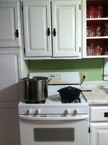
the Lodge cast iron skillet. The stove is my place in the kitchen, and what I want on that stove is either that heavy black pot frying chicken, or the large brewing kettle full of wort.
Yes, the cabinets really are that cattywampus. It’s an old house.
This was a pretty quick shoot – though I did have to get the stock pot down and declutter the counter a bit. No flash, though it took one overexposed shot to learn that. I’ve loved playing with the presets in the Flickr app, but this shot didn’t need them.
I’m a relative latecomer to the smartphone world, and I’m still getting used to this idea that I am always carrying a camera. I tried to become a shutterbug for a while in my early teens, but it never really took. If playing with the You Show and DS106 only made me better at taking photos (and more conscious/confident of the option to take photos), that would be a big step in the right direction.
A visiting faculty member in Music found out that, back in high school, I played the flute. He fixed me with a stare like a dog gives someone who doesn’t play with a ball and said “well, why aren’t you in my wind ensemble?”
I said “I used to play. It’s been 20 years!”
The corner of his mouth rose. “And tomorrow, it will be 20 years plus one day.”
I’m still not in the Wind Ensemble, but the phrase has stuck with me. And so, before the cobwebs on this blog are “2 months plus one day” old, a few short writeups.
I made this one for TDC 1051. The create starts with exploring Unsplash, looking for a photo which seems to want a DS106-themed caption.
Well, I can’t help it, I’m a punster from way back, so this is the one which spoke to me. A dad joke for a picture of dad’s workbench.
That leads to the visual challenge – where and how to place the text. I still have a lot to learn about color palettes and tricks like drop shadows which can enhance the visibility of text. I remember that brighter colors popped on this image, but they also looked cartoony, fighting with the detailed photo. It was also tricky to find the location – the light and shadow in the upper right, the diagonals of the folding rule, the bright light on the lower left. Ultimately, all those restrictions led to their own solution – if the caption doesn’t fit in a single block, where do two smaller blocks fit?
I’d welcome any comments which might help me think about this kind of design.
I’ve been intrigued by book spine stories for a while. I probably first saw them through LibraryThing’s contests (which they call bookpiles). Then recently, I was tagged in a wave of Facebook chain posts asking me to “list 10 books which have stuck with you.”
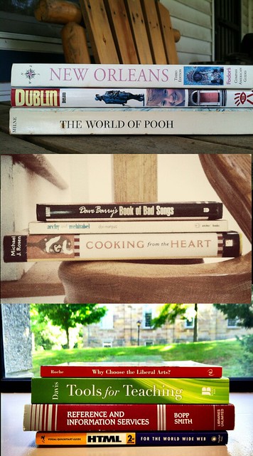
I saw the call for TDC 984 while I was at work. Looking over at my bookshelf, I saw my professional history – a paraprofessional job coding HTML, a transition into reference librarianship, a core text of instructional design, and all the while, a commitment to the broad liberal arts. So I played with different ways of arranging them in my window (it’s work, boss, honest) and snapped a picture with the Flickr app.
Rereading the instructions, it occurred to me that this is something like a Cubist exercise – it’s a picture of me, abstracted from 3 different angles at once. Obviously I didn’t achieve that with the visual style, but the realization helped me decide that I wanted to present different parts of myself more than I wanted to play with the poetic or narrative power of book titles.
The middle panel is just 3 things I like – cooking and storytelling, poetry, and broad humor. The shot is taken on the staircase in my home, largely because the exercise had reminded me of Duchamp’s Nude Descending a Staircase (No. 2).
Backgrounds are important in these shots – out the window of my office, the staircase, the top panel, which is about my wife and myself, is on our porch. They contribute to the story as much as the titles do. I used the Flickr app’s preloaded filters to get the colors where I wanted them. It felt a bit like a cheat compared to actually understanding how to set color levels, but it’s a start.
I got frustrated trying to figure out how to arrange the three pictures in GIMP. The importance I’d ascribed to the backgrounds fought with the collage arrangements I imagined. Ultimately I decided to go vertical on the grounds that a finished imperfect create beats a perfect one which never gets published.
I’m not entirely clear if it’s supposed to be read top-to-bottom or bottom-to-top… it hasn’t told me yet.
I was intrigued by the “Draw Your Own Map of the Internet” project, and moreso when it became a Daily Create. But it was this tweet from John Scalzi which really led me to get out a piece of paper and make my own.
(Oh. There’s a template. And it’s landscape, but I worked in portrait orientation. Oh well.)
This is a riff on Saul Steinberg’s View of the World from 9th Avenue. That’s why it’s in portrait orientation, and a weak attempt at perspective. It’s a personal view of the Internet – not an attempt to reflect what I know about the whole web, but how I think of my place in it. It reflects how I spend my time; it also reflects priorities in the way I use the Internet. (And of course, it reflects the way I wish to portray those things.) It’s also, really, a map of the Web, not the Internet. Notice that there’s no App Store, that I think of “email” as “the web” and not a separate thing anymore, that there’s no Netflix or Amazon Prime (which I watch through my Roku and TV, rarely my laptop or phone), that I don’t even think about protocols other that HTTP anymore.
In reflection, I’m a little troubled by the fact that I think of email as my home. That’s where I start and end the day, where I’m most reachable but also most secluded. Facebook is the patio table in my yard where most of my socializing happens; Twitter is the birdfeeder on the tree where lots of things fly in and out. Google+ is that really cool swingset over in the corner which hardly gets any use. Notice the “access road” running at an angle from the main highway, which shows the way my friends lead me out to other points on the web – occasionally their web homes, more often through citation.
Don’t blog like my bruddah!
It’s probably Click, Link, and Embed’s fault that I thought of my webspace on Reclaim Hosting as “the garage”. It’s the tinkering place, and the place from which I go places. It’s adjacent to my home, but it’s a detached garage… which may say something about how I think about being “reachable” and “building things” – or it might only reflect the fact that my real garage is detached. OK, this metaphor is officially beat to death. Sometimes a garage is just a garage.
I dunno why my car is some kind of ’70s-’80s land yacht, except that it’s probably been that long since I last drew a car.
There’s no particular reason that work-y things ended up on the left, and general interests/recreation on the right. It’s not like this is a time diary – but these are the neighborhoods which explain how I think about my time on the Web.
Of course, everything leads to Google, and Google leads to everything. Maybe that’s Oz, and I should draw little feet under my house.
There’s some stuff missing – webcomics ought to be on there somewhere, as should LibraryThing. But it’s a reasonable draft, and a fun project to reflect on the way I engage with the web.
I must really be #4Life if I’m ready to suggest a new Daily Create.
CALVINBALL! Mashup the pieces of at least 2 unrelated games into a new game. Take a picture.
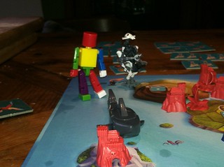
This picture actually comes courtesy of my son, who is seven. At that age, if Settlers of Catan Junior takes place on islands, then of course we should get the shark from Get Bit! And if the game is good with a little plastic figure of a Ghost Pirate, of course it would be better with a LEGO General Grievous. The robot from Get Bit! is my addition; the rainbow coloring was his.
He once called this ability “connectionation” – which is, of course, the imagination which sees new connections. I vaguely recall it being his kindergarten teacher’s word. It puts me in mind of the Stephen Johnson video about the birthing of good ideas, from week 1 of the Open DS106 syllabus. Admittedly, his mind doesn’t do anything slowly as Johnson describes, but it’s fascinating to watch the way his mind lets different ideas bump into each other and riff freely against each other.
It’s inspiring… and occasionally infuriating. The true story of that photo is that I missed the chance to get it some months ago. So this time, instead of explaining why there can only be one thief on the board, when he introduced General Grievous as the second Ghost Pirate, I got up and got the Get Bit set. Immediately, I was having a better time imagining new play than being the rules lawyer, and he pretty quickly estimated that we’d have a board full of Ghost Pirates if we didn’t pull back inside the magic circle just a bit.
Should this be accepted as a Daily Create, I’ll leave my first attempt at this shot here:
I don’t like the lighting on this shot, but it does capture some of the feel for the game. Compare and contrast with a better lit and composed overhead, which unfortunately loses all the detail of the toys:
We are 3 days outside the Straits of Consumption. Bad weather off the Cliffs of Copyright; some debate about pulling into Safe Harbor to wait it out. But there’s little change in conditions predicted, so we agreed to proceed. Weather drills have been a Fair Use of crew time.
Having reached our checkpoint, we broke the seal on our orders. Scrabble tiles clattered to the table.
Lt. Thrun could not contain himself at the sight, and has been confined to quarters for rank subordination.
As I was struggling to make sense of the tiles, Seaman Pryzbylewski presented to inform me that he had lost yet another bucket and mop over the side. I prepared to gently instruct the Admiral’s son-in-law of the importance of even the most basic duties – and noticed that he was completely enthralled by the mash of tiles.
“What do you make of it?”
He reached out, and started flipping and rearranging the tiles. He mumbled, not really answering me…
“Not a full set… odd distribution… Sir! Look at this!”
The tiles were now in a tidy line, spaces between the words. From the other side of the desk, even upside-down, I could read the message:
THERE ARE NO LEADERS HERE
I sighed, and laughed. “Well, that does sound like the Admiral to me.”

 poetry, and broad humor. The shot is taken on the staircase in my home, largely because the exercise had reminded me of Duchamp’s
 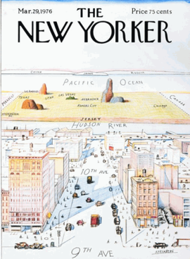 That’s why it’s in portrait orientation, and a weak attempt at perspective. It’s a personal view of the Internet – not an attempt to reflect what I know about the whole web, but how I think of my place in it. It reflects how I spend my time; it also reflects priorities in the way I use the Internet. (And of course, it reflects the way I wish to portray those things.) It’s also, really, a map of the Web, not the Internet. Notice that there’s no App Store, that I think of “email” as “the web” and not a separate thing anymore, that there’s no Netflix or Amazon Prime (which I watch through my Roku and TV, rarely my laptop or phone), that I don’t even think about protocols other that HTTP anymore.