Tender Years

I had the distinct pleasure last week of hosting Joe Lambert and Brooke Hessler from the Center for Digital Storytelling for a workshop at Kenyon. I believed that I was going in as the on-site tech support guy, so I didn’t think I was going to make a story. See,  I was going to be helpful to other people, and watch Joe and Brooke to really learn how to facilitate a story circle.

Concetta (who had been in our 2012 workshop), said that was sad, because I’m a good storyteller. (Which is not, to be honest, something I’d gone into this workshop considering.) And there was a ripple of agreement in the room, that my colleagues wanted me with them as a participant. And Joe said “no free riders.”

So I started wracking my brain for a story to tell.

The penny dropped when, during another person’s turn in the story circle, Joe pointed out that writing a letter to someone can be a great storytelling prompt. I started thinking about people I’d like to talk to, people I might owe a thank-you note or an explanation.

I remembered that I have a story which recently eluded telling.

And here’s another way to tell it.

From a storytelling perspective, shifting the audience made all the difference in the world. By making it a piece for Melanie, instead of for “the world”, clarifying an in-joke became sharing an anecdote. And technically, relating the story out loud, and getting feedback from a room of supportive colleagues, helped me find a lot of the connective tissue which I didn’t find alone with my keyboard.

So thank you, my Kenyon and CDS colleagues (and my wife, who saw a rough cut), for sharing your courage, for your aesthetic input, and for sharing this story with me.
Put me in, Coach!

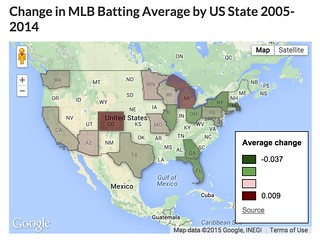
I already drew a map which tells a story, so when TDC 1237 challenged us to make a map which explains nothing, it seemed like a fitting challenge. I was inspired by the map of “Super Bowl Wins By Country” on the TDC page, so here’s:

Change in MLB Batting Average by US State 2005-2014

(Edit: this used to be an interactive map. But Google killed the product. So here’s a screenshot.)

Batting Average by State

This map is made with Google Fusion Tables. The team batting average data comes from Baseball-Reference.com; the state shapes are a resource file within Fusion Tables. (This introduces the one unintentional inaccuracy in the map – I couldn’t quickly find a shape file including both U.S. states and Canadian provinces, so the Toronto Blue Jays are just left off the map.)

More importantly, its story is a mess. For starters, who would compare team batting average over 10 years? There are so many differences in lineups and managers (and probably even park effects) that it seems like a pointless comparison. (My baseball geek friends are welcomed to debate that point.)

“Batting average by state” is almost as meaningless as “Super Bowls by country” – maybe more so, because it suggests specificity. But if there’s a useful reason to compare the average batting average of the 5 teams in California with the 1 in Maryland, I’m at a loss to explain it. (And you can barely see the poor Nats in DC.)

The state statistics are actually an average of team batting averages in the state, but every team doesn’t have the same number of at bats, so that introduces a little inaccuracy. Not much, but it would show up out at the 4th digit.

And then there’s design. Google only labels the top and bottom of the legend, so we know the bounds, but not what the middle colors correspond to. I picked a green color for half the scale, on a map which is mostly green – very bad for readability, especially in the Satellite view. I also set green to correspond to the biggest declines, and red for the biggest increases, which I think is the opposite of American expectations.

But I did learn a little about Fusion Tables, and practiced normalizing data, so that was fun!

My case, of which I’m certain

TDC 1222 asks us to write a list of our regrets, and video ourselves throwing it away.

I did it my way.

(Kids, ask your parents. Or possibly your grandparents.)

As you can tell from the watermark, I used WeVideo to make this. We’ll be using it next week at a workshop run by the Center for Digital Storytelling, and I’m the local tech support, so I thought I better try it out. It’s a web-based video editor, with a clean interface; I can see why it might work well as an intro tool for new video editors and in community outreach situations.

Also, it can import video from a USB webcam, which apparently iMovie can’t. This shot comes from my Logitech webcam, perched upside-down on top of my monitor. (That simultaneously solved the problem of how I can film my own hands, and how I could get the writing right-side-up.) My hands aren’t quite in frame enough at the end, but it got the concept.

The silence at the beginning is a little disorienting; if I were going to work more on it I’d try to capture the sound of pen on paper or maybe add a soundtrack. Let’s file that under “lessons learned”, and certainly not under “regrets!”

Your feet’s too big

Daily Create 1180 asked us to create a soundmap of our town. Instead of following the prompt as written, I picked one moment in my day – walking home in the early afternoon from a Krudas Cubensi concert at Kenyon College.

It was early April – the trees were starting to bud, and you can hear a light spring breeze blowing through the microphone at places. The birds have returned, and you can hear them chattering at each other. But it’s too early for the hum of lawnmowers, not warm enough yet for the drone of air conditioners. Gambier is a rural town; I think in the 6 minute walk you’ll hear 3 cars go by.

You’ll also hear my feet. Boy, will you hear my feet. I really thought I was holding my iPhone high enough to not get so much of that noise, but apparently not. So, there’s an excuse to learn something new – I opened up the graphic equalizer in GarageBand, turned on the analyzer so I could see where the frequencies of my footfalls lay, and turned those ranges down. They’re still prominent – it is a walk, after all – but I don’t think they’re as dominant as they were in the original.

This is my walk to work. I’ve probably taken it more than 4,000 times. But I usually take it with my headphones on and music or a podcast going, so I miss these sounds – which means I miss the chance to contemplate the seasons and the neighborhood. I appreciate TDC reminding me that there is value in taking a walk just to listen.